Lou who? How Kahn came to design the Academy library

The story of how renowned architect Louis Kahn came to design the Academy library is a tale with many heroes, but Principal Richard Day and librarian Rodney Armstrong are its greatest protagonists.
The endeavor to build a new library on campus was eight years old with near-finished blueprints in 1965 when Day, newly installed as the Academy’s 11th principal, met
with Armstrong to review the plans for the project. “When he finished, he asked my opinion,” Armstrong recalls. “I responded that the plans met the program requirements and the Trustees’ request that the building blend in with the adjacent structures. Dick Day looked me in the eye and asked me if I liked it.
“I had to respond that it was not to my taste.”
Day boldly scrapped the plans and ordered Armstrong to chair a committee to start over.
“At the first meeting of our small committee, Elliot Fish of the modern languages department startled us by saying he didn’t know
why we were going through such a lengthy procedure when he could tell us right then and there who our choice would be,” Armstrong said. “Silence was followed by dubious murmurs and calls of ‘Who?’
“’Why, Lou Kahn, of course,’ he replied. ‘Lou who?’” we chorused.
Kahn needed no introduction to architecture aficionados. His distinct style married the simplicity of Modernist form with historical inspirations, all with the mandate for functionality. While he favored simple materials such as brick and concrete, he used them in new ways.
“He uses hard materials, but the brick, for example, is visually very warm, in a dozen shades from bright red to chocolate-brown; in the summer, the bricks are literally warm to the touch, which helps insulate the building,” said William Richards ’00, who holds a PhD in art and architectural history and runs an editorial and design consultancy. “He’s using these hard materials, but he’s also giving them personality.”
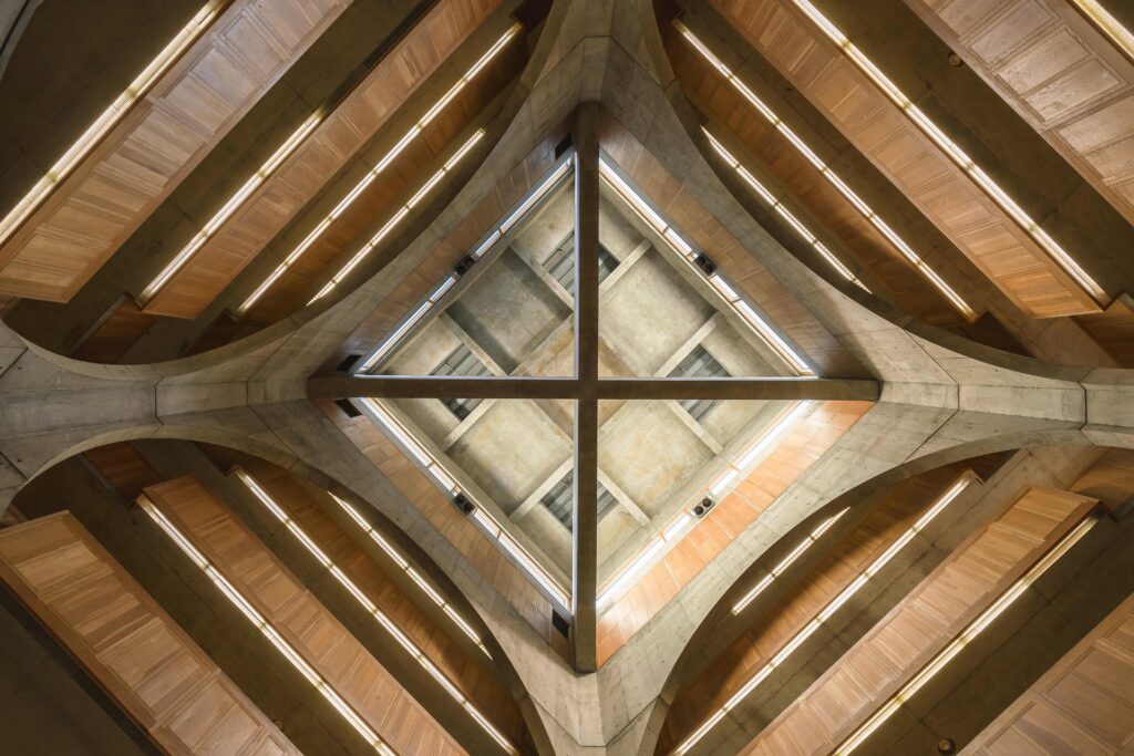
He also became known for his use of natural light. The Academy library is suffused with light, which changes the character of its spaces depending on time of day, season and weather.
“From the central hall you have these great big round openings through which you can see the bookcases in gorgeous white-oak panel, and then there’s the light shining in from the atrium,” said Carl Jay, director of historic preservation at Shawmut Design and Construction. “There’s beauty in all of that, in being in that great hall, looking up.”
“His library fulfilled our dreams and hope and did indeed shift the center of our school world,” Armstrong said. “Immodestly, I add that it is the greatest secondary school library, here or abroad.”
